[ad_1]
A regular part of Australian Photography magazine for more than a decade, the Image Doctors, photo educator Saima Morel and professional photographer Anthony McKee, can give constructive feedback on your images, with a selection of their favourite submissions appearing in print in AP mag every month.
If you want feedback on your images (it’s free!), you can find out the details for submission here. Our winner each month will receive a fantastic prize thanks to our amazing sponsors SanDisk.
This month’s winner
TITLE: Self Portrait
PHOTOGRAPHER: Tiago De Almeida
DETAILS: Nikon D5500, 18-200mm lens @ 28mm. 1/100s @ f5, ISO 400.

Tiago made this image while exploring Rembrandt lighting with a “soft box” lighting kit.
“I had never tried self portrait photography as I was never comfortable in front of the camera, but have been inspired by street portrait photographer Lee Jeffries. I used a remote trigger and experimented with different lighting, then I edited the image in Lightroom, really going for strong textures.”
Self portraiture is a good exercise for any photographer, in part because you can be in the head of both the photographer and the subject at the same time (and it lets you explore ideas you might not be ready to try yet with a real subject).
All up, I do like this image; the lighting is very good, the background works well and the model looks reasonable too. The one thing that I would like to improve though, is the cropping of the image – you have cropped into the woollen beanie both at the top and the right of the frame, but both crops seem timid. Personally, I would like to see more cropping at the top of the image, but no cropping on the right – you could almost afford to shoot a little wider and then crop to square. Nonetheless, well done.
Anthony’s Tip: Try shooting portraits in the horizontal and then cropping to square; the square form can give images a really strong look.
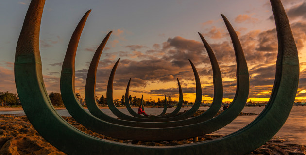
TITLE: Sunset at Kamay Botany Bay National Park
PHOTOGRAPHER: Denny Christian
DETAILS: Sony A7 II, Sigma 28-70mm f/2.8 lens @ 28mm. 4s @ f7.1, ISO 50.

Denny did not give us much information about this image, aside from “Post processing in Lightroom with a bit adjustment in colour, and cropped to make pic look more symmetry”. What we do know though, (from Denny’s 2599 Instagram posts) is that Denny enjoys photographing Sydney and its many National Parks.
I love the use of symmetry in this image, and your use of a model in the red jacket. What I do have a problem with though, is that the model is competing for attention from that large area of blue sky in the top left of the picture.
There are two ways I would have changed this image; at the time I of making the photo I would have moved the model a little closer to the camera so they were not so distant in the frame. By way of improving the image after the event though, I would crop the image down to a 16 x 9 ratio, keeping most of the foreground and losing some of the sky. This will enhance the graphic nature of the sculpture and the model will look more significant in the frame.
Anthony’s Tip: If in doubt, explore your crop options. Removing some bright sky or eliminating a distracting object from the edge of your frame can often improve an image.
TITLE: Sugarloaf
PHOTOGRAPHER: Dani Maver
DETAILS: Sony A7 III, 24-70mm f/2.8 lens @ 26mm. 1/160s @ f4, ISO 100.

Dani made this image at Sugarloaf reservoir in Christmas Hills, near Melbourne. “I have been taking photos for about a year and I’m trying to teach myself how to look at light. I went to the reservoir intending to take photos of sunrise and hot air balloons, but over my shoulder I saw the light reflecting off the guard rail of the dam wall. I have ‘enhanced’ the warmth of the reflection and increased the contrast in post”.
Dani, you are heading in the right direction! Learning how to see light and if it “hard” or “soft”, knowing how it affects the subject and ultimately how you can work or even manipulate this light will make you a better photographer, but it takes time. I once asked my mentor how long it takes to understand light and he said ten years. I reminded him of this comment a few years later and he revised the number up –
“it takes a lifetime!”.
As for this image, I think you have gone a little too wide here. If you crop in on the dam and eliminate the left of the frame you will make this image more graphic – and interesting.
Anthony’s tip: Remember, less can be more – crop in and let others guess what they are looking at.
TITLE: The Waterfront
PHOTOGRAPHER: Susan Shanta
DETAILS: Olympus E-M5 Mk III, 14-24mm lens @ 26mm. 1/500s @ f8, ISO 200.

Susan recently discovered the waterfront at Geelong. “As I walked around the long boardwalk, it felt like I was walking on water. Being a bay within a bay, the water is calm and reflective. A mild but cloudy day lent itself to the amazing cloud reflections on the glassy surface of the water.
The boardwalk sits flush with the water so I could get down lower and shoot across the surface. The posts of the water gives the impression of a scar in the middle holding the sky and water together. With a touch of yellow in the buoy to the right, being the contrast splash of colour complimenting.”
Hey Susan, this is a great image, and your synopsis above covers it well. There are a couple of things that you might have done differently though. Many people apply the “Rule of Thirds” to EVERY image, but there are occasions when placing the horizon line is perfectly acceptable, particularly when working with pure reflections and such a strong dividing line.
You can still crop this image so that the boardwalk is in the middle of the frame and it will look very strong. Also, if you are using Lightroom or Adobe Camera RAW, try using a Gradient mask along with the Dehaze tool (along with a little increase in the exposure); this will help add life to the reflection!
Anthony’s tip: Dehaze is one of the most useful mask adjustments in Lightroom and ACR. Use it prudently as a Mask option to add life to otherwise flat areas on an image.
TITLE: Sun, Moon and Stars
PHOTOGRAPHER: Rod Coysh
DETAILS: Pentax KP, 18-55mm lens @ 18mm. 30s @ f3.5, ISO 3200.

Rod made this image at Whiskey Bay in the Wilson’s Promontory using his Pentax KP on a tripod and one single 30 second exposure. Post processing was done using the Pentax Digital Camera Utility 5 from a RAW image. As Rod comments – “The light from a new moon can be seen in the upper right hand corner of the image, with the after glow of a sunset in the bottom right hand corner”.
Astrophotography is challenging because we are asking our cameras to do something that we ourselves are not that good at – seeing in the dark. We can see the camera’s struggle in the “noise” of the picture (the graininess) and also the hint of star trails.
Some people buy ‘fast’ f1.4 and f1.8 lenses for astrophotography, but another option is to work with what you have, and actually reduce the noise by using a lower ISO (like ISO 200) and then use the Bulb mode on your camera to create a 10 minute exposure. The noise will be significantly reduced but you will also get longer star trails, and that might make the image more interesting.
One other thing that I would try if you were shooting this image again would be to put the camera into the vertical so that you can make more of the beach in the foreground. Otherwise, good effort.
Anthony’s Tip: If you are struggling in low light, don’t be scared to put the camera onto a solid tripod, drop the ISO down and explore alternate options.
[ad_2]